CULTIVATING INTERFAITH RELATIONSHIPS IN THE WORKPLACE
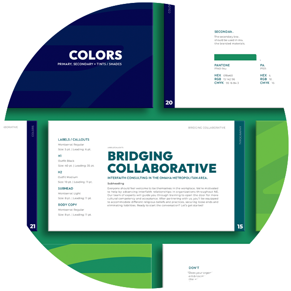
// logo + brand design, Bridging Collaborative: a consultive extension of Tri-Faith Initiative
We are Bridging Collaborative, the consultative extension of Tri-Faith Initiative. Our objective is to help teams cultivate corporate workspaces that advance interfaith relationships and understanding. We are thought leaders training others to have open conversations and greater cultural competency. Bridging Collaborative serves the full spectrum of religious identity, from people of no faith to people of all faiths. Our clientele includes HR representatives, teachers, nonprofits, and universities, among others.
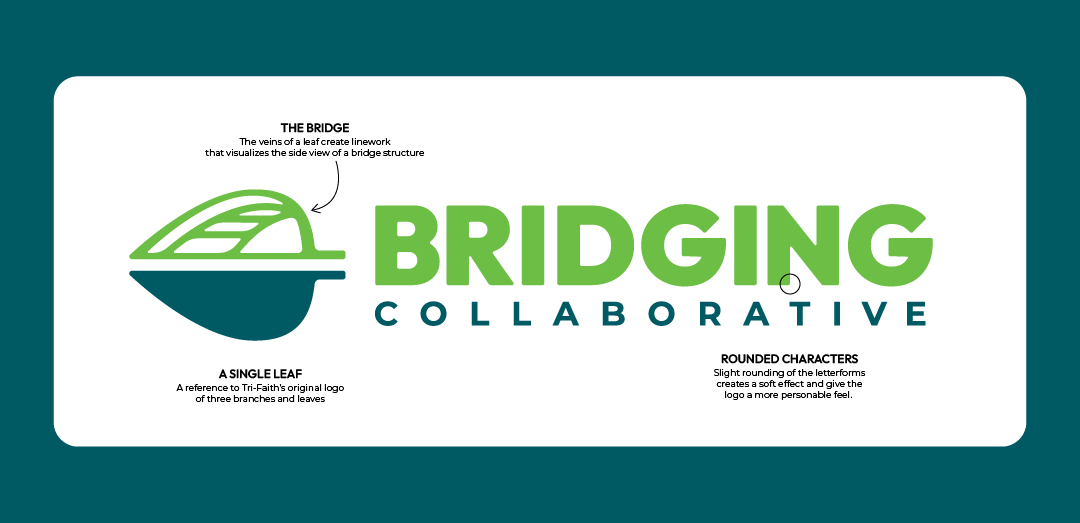
Named for the bridge that graces their campus in Omaha, Bridging Collaborative needed a logo that was professional, modern, and a welcoming. The leaf motif derived from the Tri-Faith Initiative’s brandmark, was given veins that reslembled the classic feel of a arched, wooden bridge. This bridge was placed above a blue lower piece to further exentuate it’s resemblence to a bridge over water. The typeface here is a strong, bold selection with geometric sans shapes that feel clean.
view brand guidelines ︎︎︎





credits
—
—
role
designer
designer
team
director of design: chelsea woghlemuth; creative director: andrew decamp; copywriter: porscha colville
director of design: chelsea woghlemuth; creative director: andrew decamp; copywriter: porscha colville
